
Where have I been published?


Magazine Adverts
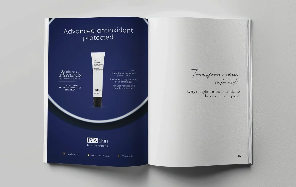
Magazine advertising calls for high-impact visuals paired with intelligent restraint. I craft layouts that draw the eye through controlled tension—balancing dense textures with white space, and type hierarchy with image weight. Each element is placed with purpose, using subtle alignment and compositional flow to maximise attention within a fixed frame. I often apply split-complementary or analogous colour schemes to evoke mood while maintaining brand integrity. Typography is chosen not just for aesthetics, but for tone, readability, and resonance with the target audience.

Here, typography takes centre stage. An expressive modern sans‑serif font contrasts against a light background. A model leads the eyes to the type which is offset by cleverly placed product images.

A monochrome spread punctuated by a subtle coral accent—a deliberate pop of colour that guides the eye along the spine of the pages. Cool neutrals and precise composition heighten the impact. This layout thrives on restraint and rhythm, colour deployed sparingly for maximum effect.

A full-bleed photograph overlaid with a simple typographic caption. The type is clean, light, and understated, choosing clarity over flash. Compositionally, it respects the image’s mood, letting the photo breathe beneath a whisper of text and light icons.

A tall, rising column forms of text and imagery, which is bottom heavy—an elegant asymmetric dance. Generous white space softens the structure, while typographic alignment echoes the photo’s vertical rhythm. The interplay feels organic and well‑measured.

A bold spread where a minimalist serif headline anchors the layout. Black-and-white imagery cuts a crisp contrast, while the sans‑serif subhead glides beneath—balancing weight and refinement. Compositionally, ample breathing space channels a calm focus, letting typography and photography work in harmony.
A dynamic, minimalist design where image blocks and text boxes alternate in a rhythmic pattern. The layout shows playful yet precise geometry, guiding the reader smoothly across the spread. The heading typography is unapologetically bold—bringing cohesion and energy to the visual narrative.

A considered bright portrait layout with symmetrical text arrangement. The colour provides energy, helping to express the product. Subtle typographic hierarchy—via size and weight—pulls the reader in gently, while the spacing keeps things feeling open and airy.