
Well-designed printed collateral guides the reader through a narrative. I build brochures and leaflets with layered typographic systems that lead naturally from headlines to details, supported by well-structured white space and intuitive flow. I often use modular grids to maintain order, while repetition and alignment help create familiarity and unity. Textures, paper choices, and tactile finishes add depth, while colour decisions—based on harmony, temperature, and contrast—are made to support both mood and clarity.
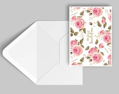
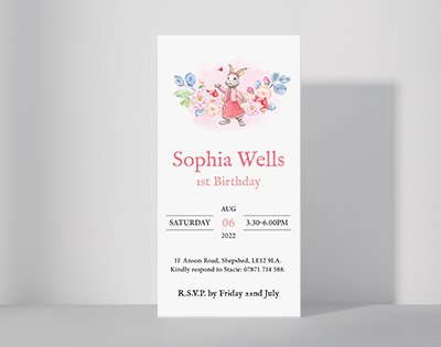
Leaflets & Brochures
Here, grid rhythm is leveraged: image blocks and text modules interlock neatly. Sans‑serif headlines contrast with more human serif body text. The layout channels a friendly yet structured tone—ideal for engaging readers on the go.

A leaflet that breathes: spacious margins, clear modular sections, and tonal colour cues. Headline and subhead sections are distinct yet unified. The typography hierarchy is clear—serif and sans play together to create a friendly, trustworthy voice.

A calm, editorial layout: generous spacing, minimalistic headers, and soft colour details. The composition balances photography with text elegantly. Typography is understated—clean, easygoing, and just precise enough.
A strong footer banner balances a photographic hero section. Bold sans headings top the page; serif copy adds weight below. The composition respects hierarchy—inviting eyes to scan easily and engage deeper.
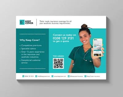
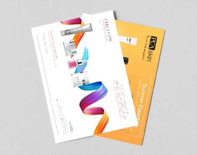
A confident mix of photography and typography: bold text runs across the mid‑section, splitting the banner into image and message zones. The composition uses contrast and balance perfectly—picture above, call‑to‑action below, all tied together by a bold accent hue.

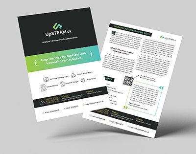
This one blends imagery and text with flair. The layout frames photographs in bold shapes, text sits beside or atop, always readable. Colour accents make key info pop. It’s structured but with personality—designed to delight as well as inform.
This spread uses square image modules alongside neat text blocks—a grid that feels contemporary and clean. Accent colours enliven key headlines. Serif body text adds approachability, underlined by ample white space.
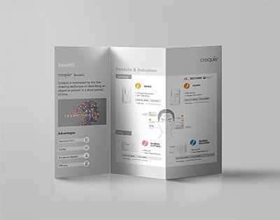
A smart tri‑panel brochure—image, headline, body text—all form a visual narrative on folds. The accent colour threads through the design, creating unity. Typography is measured: serif for character, sans serif for readability. White space allows each panel to resonate.
A strong‑on‑first‑glance booklet: large hero image, confident headline, then crisp details. The composition is balanced—image and message align symmetrically. A clean sans‑serif and sharp colour pop anchor the design with clarity.
A vibrant, image-led style: a hero shot dominates, supported by coloured text blocks below. Sans-serif headings anchor the flow, serif body copy adds warmth. Grids and snap-to edges keep everything tidy and inviting.
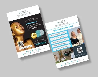
A friendly, modular design: coloured blocks pair with cropped images and clear typography. Sans-serif headlines guide, serif copy supports. The layout feels personable—open, fresh, and easy to navigate.