
Email Design
Emails demand clarity, responsiveness, and fast visual scanning. I focus on creating lightweight, modular designs that adapt cleanly across devices while preserving visual hierarchy. Colour choices are made with accessibility and emotional response in mind—often using triadic or monochromatic schemes for balance and impact. I optimise typography for legibility in digital environments, ensuring consistency in tone and spacing. Careful spacing and rhythm guide the user’s journey from subject line to CTA, without visual noise.
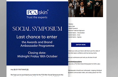
A two‑column email layout: image on left, text on right. Typography is neat and accessible; buttons sit squarely beneath. Generous padding and responsive spacing allow the design to adapt beautifully across devices.
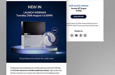
A multi-section email design: image headers punctuated by headline and body text modules. Contrast blocks help guide the reader. Typeface variations—bold for headlines, clean for text—make navigation intuitive and friendly.

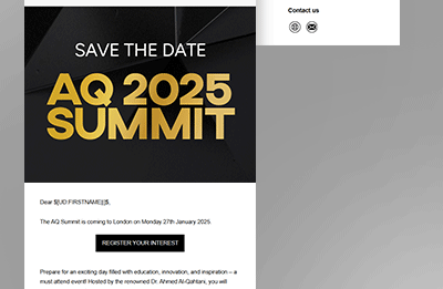
A static variant of the animated mock-up: bold hero section, clear headline, strong CTA. The simplicity of the layout helps the message land fast. Sans-serif fonts ensure clarity, while blocks of muted colour frame the content.

A playful yet professional style: alternating coloured backgrounds and image/text layout sections. Headers pop in sans serif, copy is neat and spaced. Button CTAs are clear, brisk, and easy to tap or click.
A digital-first hero: bold header image, key message overlay, plus a clear CTA button below. Colour blocks guide the reader down. Typography is web‑safe sans serif—crisp on-screen and well‑spaced for mobile readability.
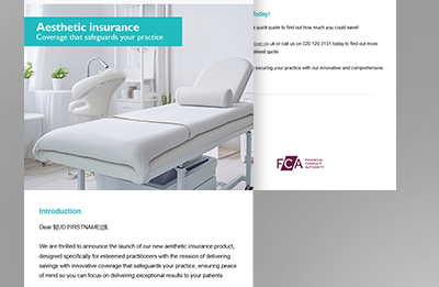
Single-column email layout with stacked content: hero image, headline, text, button. Clean white space defines each section. Typography is bold and clear—designed for quick scanning on mobile.